10 Best Business Intelligence Software and Platforms for Sales Teams
Adam Hossain
Published October 11, 2026
19 min

Complete Agentic Email Outreach
AI agents find and enrich prospects, personalize emails, follow up, and handle replies with your meeting link.
Claim Your FREE Credits
Your CRM tells you what happened last quarter.
But it rarely explains why deals stalled, which pipeline is real, or where revenue is slipping away.
You have plenty of data, just not clear answers. And that's where most sales leaders get stuck.
This guide compares business intelligence tools by sales use case, data requirements, cost, and setup effort.
That way, you can pick a tool that answers real sales questions, not just one with nicer dashboards.
Here's what you'll learn:
- What BI tools do for sales teams
- A quick comparison of 10 options
- How to choose and test the right tool
What Business Intelligence Tools Do for Sales Teams
Before comparing options, it helps to know what BI actually adds to the sales stack you already have.
Business intelligence tools connect data from different systems and analyze it together.
That gives you clearer answers on pipeline health, targeting, and where revenue is really coming from.
Here's how it compares:
- CRM reporting: Shows what happened, like deals closed this month.
- BI analysis: Explains why, by combining CRM, activity, and revenue data.
- Prospect enrichment: Adds contact and company details so you can act on findings.
Connect CRM, Activity, and Revenue Data
BI only works when your records share common fields.
Essential fields include account ID, opportunity ID, owner, stage history, deal value, lead source, and outcome.
Shared IDs link each deal to its activity and revenue.
From there, the workflow is simple: connect → clean → define metrics → analyze → act.
Suggested Reading:
5 Best CRM With LinkedIn Integration + How To UseTurn Sales Metrics Into Decisions
Stage conversion, win rate, and sales cycle show where deals stall and which segments deserve focus.
Say healthcare closes 30% of deals at higher values, while retail closes 15%.
That's your signal to prospect more in healthcare, not everywhere.
Gartner reports that 73% of buyers steer clear of suppliers whose messaging feels irrelevant.
Business Intelligence Tools — Quick Comparison Table
Before going tool by tool, here's a quick look at how each option compares.
You'll see what each tool is best for, what it costs to start, and what setup it needs.
Use it to narrow your shortlist before reading the full breakdowns below.
Prices are starting list rates, mostly billed annually, as of October 2026. Check each vendor's pricing page before you buy.
10 Best Business Intelligence Tools and Complementary Software
The table gives you the quick view.
Now let's look closer at how each tool handles a real sales scenario.
For every option, you'll see its use case and data connections, pricing and setup, plus strengths and limits.
That keeps every comparison side by side.
1. Oppora

BI tells you which accounts deserve attention.
Oppora is an AI sales platform that automates prospecting, enrichment, outreach, and follow-ups through self-running workflows.
For BI-driven sales teams, it closes the gap between spotting an opportunity and actually reaching the right decision-makers.
Think of it as the outreach layer that sits next to your BI platform.
Sales Use Cases and Practical Example
Oppora covers the steps between a promising insight and a booked meeting:
- Prospect discovery: Search 700M+ contacts and 42M+ companies using filters and intent signals.
- Enrichment and verification: Find and verify emails before anything goes out.
- Targeted outreach: Run email and LinkedIn sequences from one workflow.
Say your BI dashboard shows fintech deals closing faster than any other segment.
You can pull VPs of Sales at fintech companies, verify their emails, and launch a tailored sequence the same day.
Data Connections and Setup
Setup starts with your targeting criteria, like industry, company size, and job title.
Next, you connect your sending mailboxes and LinkedIn account.
Contacts, replies, and deal outcomes then sync to Zoho, HubSpot, Salesforce, or Pipedrive, depending on your plan.
That keeps campaign results visible in the same CRM your BI tool reads from.
Pricing and Best Fit
Each plan gives you separate credit pools for data, phone, and AI tasks, with rollover on paid plans:
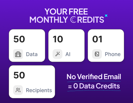
- Free: $0, with 50 data credits and 3 mailboxes
- Pro: $34/month, with 10,000 data credits, 25 mailboxes, and Zoho sync
- Max: $79/month, with 25,000 data credits, 50 mailboxes, and HubSpot, Salesforce, and Pipedrive sync
- Enterprise: From $499/month for teams reaching 50,000+ contacts monthly
Need more? Add-on packs start at $5 per 1,000 verification credits, so you don't have to upgrade.
Oppora suits lean sales teams that need ready-to-contact prospects without stitching together separate tools.
Pros and Cons
Here's what users highlight in Oppora's G2 reviews:
Pros
- Quick setup and a clean, easy interface
- Verified data that protects bounce rates and domain reputation
- Research, verification, and email or LinkedIn outreach in one place
Cons
- Free and entry-level credits run out fast at scale
- Advanced workflows take time to learn, with limited documentation
- No BI dashboards or revenue analysis, so it complements BI tools
2. Microsoft Power BI

Power BI is Microsoft's reporting platform for turning CRM and finance data into shared dashboards.
For sales managers, it handles the reports you review every week: pipeline, targets, and revenue.
Sales Use Cases and Practical Example
A typical Power BI sales dashboard covers three views:
- Pipeline visibility: Open deals by stage, owner, and close date
- Target attainment: Closed revenue against quota by rep or team
- Stage conversion: How many deals move from one stage to the next
Say each territory has a $500K quarterly target, and you aim for 3x pipeline coverage.
If the East holds $1.6M in pipeline but the West has only $900K, you know where reps need more opportunities.
Data Connections and Setup
Power BI connects natively to CRMs like Salesforce and Dynamics 365, plus spreadsheets and databases for targets and revenue.
Someone then builds a data model linking opportunities, quotas, and invoices through shared account IDs.
Scheduled refreshes keep numbers current, up to 8 times a day on Pro.
Row-level security lets each rep see only their own territory.
Pricing and Best Fit
Pricing depends on who builds reports and who views them:
- Desktop: Free for building reports locally
- Pro: $14/user/month, needed to share reports and view shared ones
- Premium Per User: $24/user/month, with larger models and 48 daily refreshes
- Fabric capacity: For large teams, where viewers on F64 and above don't need individual licenses
It fits teams already on Microsoft 365, where E5 includes Pro, with someone comfortable modeling data.
Pros and Cons
From Power BI's G2 reviews:
Pros
- Drag-and-drop dashboards that turn CRM data into clear visuals
- Works smoothly with Excel, Teams, and other Microsoft tools
- Row-level security lets one master report serve every team
Cons
- DAX and advanced modeling come with a steep learning curve
- Large datasets can refresh slowly, and updates run on a schedule
- Licensing feels confusing, and sharing costs climb as viewers grow
3. Tableau

Tableau is a visual analytics platform built for exploring data, not just reporting it.
It's strongest when you need to understand why one territory, industry, or segment performs differently from another.
Sales Use Cases and Practical Example
Sales managers use Tableau to compare three things across segments:
- Win rates: Which territories or industries convert best
- Deal values: Where the biggest contracts come from
- Sales cycles: How long deals take to close in each segment
Say the Northeast closes deals 40% larger than other regions but takes 30 days longer.
Filtering by industry might show that healthcare deals drive both, since they involve more stakeholders.
That tells you to staff the region differently, not push reps harder.
Data Connections and Setup
Your CRM data needs a few core fields: opportunity outcome, territory, industry, deal value, created date, and close date.
Tableau connects directly to Salesforce, spreadsheets, and most databases.
Analysts clean the data in Tableau Prep, build dashboards in Desktop, then publish them to Tableau Cloud or Server with user permissions.
Plan for analyst time to build and maintain dashboards before managers can self-serve.
Pricing and Best Fit
Tableau uses role-based licensing, billed annually:
- Creator: $75/user/month to build data sources and dashboards
- Explorer: $42/user/month to edit existing dashboards
- Viewer: $15/user/month for read-only access
Enterprise editions raise those rates to $115, $70, and $35, and every deployment needs at least one Creator.
It fits teams with a dedicated analyst who needs to dig into segment performance, not just track weekly numbers.
Pros and Cons
From Tableau's G2 reviews:
Pros
- Drag-and-drop interface for building interactive dashboards
- Connects to multiple data sources in one view
- Fast, flexible exploration that makes segment comparisons easy
Cons
- Expensive for small teams, especially as seats add up
- Advanced calculations come with a steep learning curve
- Performance can slow with large or complex datasets
4. Looker

Looker is Google Cloud's BI platform built around a shared semantic layer.
You define each metric once in code, and every dashboard uses that same definition.
That makes it a strong fit when sales and finance keep arguing over whose numbers are right.
Sales Use Cases and Practical Example
Looker standardizes the reports that usually drift apart between teams:
- Pipeline: What counts as qualified, and at which stage
- Bookings: When a deal officially counts as closed
- Revenue: Whether you report ACV, ARR, or recognized revenue
Say sales reports $2.1M in Q3 bookings, but finance shows $1.8M.
The gap comes from multi-year deals that sales counts in full and finance counts by year.
Define "bookings" once in Looker, and both teams see the same number.
Data Connections and Setup
Looker queries your data warehouse directly, such as BigQuery, Snowflake, or Redshift.
So your CRM and billing data need to land there first, joined by account ID.
A developer then writes LookML, the modeling language that defines your joins, metrics, and business logic.
Don't confuse it with Looker Studio, formerly Data Studio.
That's Google's free dashboard tool, which doesn't have LookML's governed semantic layer.
Pricing and Best Fit
Looker pricing is quote-based and has two parts:
- Platform edition: Standard, Enterprise, or Embed
- User licenses: Developer, Standard, and Viewer seats, priced by access level
Third-party estimates put the Standard edition around $60,000 a year before extra seats.
Warehouse query costs also add up, since every dashboard runs live queries.
It fits mid-size and larger teams with a data engineer and a real need for governed reporting.
Pros and Cons
From Looker's G2 reviews:
Pros
- One source of truth, so departments stop reporting conflicting numbers
- Business users explore live data without writing SQL
- Drill down from a summary to the deals behind it
Cons
- LookML has a steep learning curve and needs data engineers
- Complex dashboards can load slowly and raise cloud compute costs
- Pricing is heavy for smaller teams
5. Qlik Cloud Analytics

Qlik Cloud Analytics is Qlik's SaaS analytics platform, built on its associative engine.
Instead of following fixed drill paths, you click any value and instantly see what's linked to it and what isn't.
That makes it useful for tracing how lead sources, segments, and deal outcomes connect.
Sales Use Cases and Practical Example
Qlik helps you follow a lead from first touch to closed deal.
Say webinars and paid search both send you plenty of leads.
Select "mid-market SaaS" as a segment, and Qlik highlights related records in green and excluded ones in gray.
You might find webinar leads convert to opportunities at twice the rate of paid search in that segment.
That's a clear signal to shift budget toward webinars for mid-market accounts.
Data Connections and Setup
Qlik needs three record types linked by matching fields:
- Campaigns: Lead source, campaign ID, and date
- Accounts: Account ID, segment, and industry
- Opportunities: Account ID, stage, value, and outcome
Data loads through the Data Manager or load scripts, where Qlik links tables by shared field names.
Scheduled reloads then keep your apps current.
If field names don't match cleanly, associations break, so data prep matters.
Pricing and Best Fit
Qlik Cloud Analytics bills annually, mostly by data capacity:
- Starter: $300/month for 10 users and 10 GB
- Standard: From $825/month with 25 GB
- Premium: From $2,750/month with 50 GB and predictive analytics
- Enterprise: Custom pricing for larger volumes
It fits teams with several connected sales datasets and an analyst who can model them.
Pros and Cons
From Qlik Sense's G2 reviews, the product behind Qlik Cloud Analytics:
Pros
- Associative engine reveals hidden relationships across datasets
- Fast in-memory analysis for slicing large data
- Connects multiple data sources in one app
Cons
- Load scripting and setup take technical skill
- Associative concepts can confuse new users
- Limited options for customizing certain visuals
Suggested Reading:
AI Sales Prospecting Workflow: Steps From Lead to Outreach7. Domo

Domo is a cloud BI platform that pulls sales, marketing, and finance data into one shared workspace.
It works best when your biggest revenue question can't be answered from a single system.
Sales Use Cases and Practical Example
A common example is acquisition-to-revenue analysis.
Marketing knows what each campaign costs, sales knows deal value, and finance knows what actually closed.
Domo brings all three into one dashboard.
Say paid search and events each cost $50,000 a quarter.
Both create $400,000 in pipeline, but events close $150,000 while paid search closes $40,000.
Without finance data, the two channels would look equally effective.
Data Connections and Setup
Domo's setup comes down to three layers:
- Connectors: Pre-built links to your CRM, ad platforms, and accounting tools
- Transformations: Magic ETL, a drag-and-drop tool for cleaning and joining data, with SQL as an option
- Shared identifiers: Account or campaign IDs that match records across departments
Each team should own its source data, so someone is accountable when numbers don't match.
Admins then set access rules, like hiding margin data from reps, and schedule refreshes for each dataset.
Pricing and Best Fit
Domo uses consumption-based credits instead of per-user seats.
There's a 30-day free trial, but paid plans are quoted through sales.
Total cost depends on data volume, refresh frequency, and how many transformations you run.
Implementation and training are billed separately too.
One more factor: Progress Software agreed in July 2026 to acquire Domo's platform business, so ask about roadmap and contract terms before signing.
Domo fits mid-size and larger companies coordinating reports across several departments.
Pros and Cons
From Domo's G2 reviews:
Pros
- Pre-built connectors pull data from almost any tool
- Magic ETL makes blending messy data drag-and-drop simple
- Real-time dashboards, including on mobile
Cons
- High, non-transparent pricing that requires tracking credit usage
- Steep learning curve beyond basic features
- Deep, granular exploration can feel clunky
8. ThoughtSpot

ThoughtSpot lets you explore sales data by typing questions, much like a search engine.
Its AI agent, Spotter, turns plain-English questions into charts and tables in seconds.
That helps managers dig past fixed reports without waiting on an analyst.
Sales Use Cases and Practical Example
Managers typically ask questions like:
- "Win rate by segment last quarter"
- "Average deal size by territory this year"
- "Pipeline created per month, compared with last year"
Say you ask which segments had the lowest win rate last quarter.
ThoughtSpot shows SMB healthcare at 12%, well below your 25% average.
You then drill into the underlying deals and spot a pattern: most stalled after pricing calls.
Data Connections and Setup
ThoughtSpot queries cloud warehouses like Snowflake, BigQuery, and Databricks directly.
Before anyone asks a question, your data team builds a model with three things:
- Datasets: Opportunities, accounts, owners, and dates
- Metric definitions: Exactly how win rate or pipeline is calculated
- Business terms: Synonyms, so "close rate" and "win rate" mean the same thing
Without this, ambiguous terms or missing fields return answers that look confident but are wrong.
So validate results against a report you already trust.
If ThoughtSpot's Q3 win rate doesn't match your CRM, fix the model before rolling it out.
Pricing and Best Fit
ThoughtSpot publishes per-user pricing, billed annually:
- Essentials: $25/user/month for 5 to 50 users and up to 25M rows
- Pro: $50/user/month for up to 1,000 users, 250M rows, and 25 Spotter queries per user monthly
- Enterprise: Custom pricing for larger deployments
It fits sales managers who want answers on their own, backed by a clean, well-modeled data warehouse.
Pros and Cons
From ThoughtSpot's G2 reviews:
Pros
- Natural-language search makes data as easy to find as a web search
- Spotter delivers quick insights without analyst support
- Fast, real-time search on cloud data warehouses
Cons
- Needs solid data modeling before it works well
- Searching across multiple datasets can be limited
- Can load slowly or crash on complex searches
9. SAP Analytics Cloud

SAP Analytics Cloud combines BI, planning, and forecasting in one platform.
For sales, its biggest strength is putting actual results next to the plan, so you can see the gap and adjust targets in the same place.
Sales Use Cases and Practical Example
Teams use it for two connected jobs:
- Actual-versus-plan reporting: Revenue and bookings against targets by region, product, or rep
- Sales planning: Building next quarter's targets and testing what-if scenarios
Say EMEA closes Q3 at $3.2M against a $4M target.
Drilling in shows the shortfall sits in Germany, where two large deals slipped to Q4.
You can then update the forecast and rerun the Q4 plan without exporting anything.
Data Connections and Setup
This scenario needs three sources:
- CRM: Opportunities, owners, regions, and close dates
- Finance: Booked and recognized revenue, often from SAP S/4HANA
- Planning: Targets and assumptions, stored in SAC planning models
SAP systems connect with little effort, but non-SAP sources like Salesforce usually need import connections or SAP Datasphere.
Admins then build models that align fiscal periods and currencies, so a euro deal in September maps to the right quarter.
Role-based permissions control who sees and edits each region's numbers.
Pricing and Best Fit
SAP Analytics Cloud licenses by capability:
- Business Intelligence: From about $36/user/month
- Planning: Custom quote from SAP
A 30-day free trial is available.
It fits companies already running SAP ERP, with admins who can manage models and integrations.
Pros and Cons
From SAP Analytics Cloud's G2 reviews:
Pros
- Analytics, planning, and forecasting in one platform
- Smooth integration with SAP systems like S/4HANA
- Strong role-based security, so each user sees only their data
Cons
- Slow performance with large datasets or complex models
- Setup gets complex with non-SAP systems and advanced planning models
- Steep learning curve, and costly for smaller teams
10. IBM Cognos Analytics

IBM Cognos Analytics is an enterprise BI platform known for structured, governed reporting.
It works best when leadership needs the same report, built the same way, delivered to every region on schedule.
Sales Use Cases and Practical Example
A typical monthly management pack covers:
- Regional results: Revenue and bookings by region and product
- Pipeline summaries: Open deals by stage and expected close date
- Target attainment: Actuals against quota for each team
Say you send a monthly sales report to eight regional directors.
Right now, each region calculates "qualified pipeline" slightly differently.
With Cognos, one report definition feeds every region, so the numbers compare cleanly in leadership reviews.
Data Connections and Setup
Setup starts with a source model, built in data modules or Framework Manager, that defines tables, joins, and metrics.
Report inputs typically include CRM opportunity data, targets from finance, and regional hierarchies.
A report developer then builds the template once and adds prompts for month and region.
Distribution comes next:
- Bursting: One run splits the report so each director gets only their region
- Scheduling: Reports go out automatically by email or through the portal each month
- Permissions: Role-based security controls who can view, edit, or run each report
Pricing and Best Fit
IBM offers Cognos as a cloud service or on-premises:
- Standard: From about $11/user/month
- Premium: From $44.90/user/month
- On-premises: Custom pricing, plus your own server and infrastructure costs
It fits larger organizations with BI administrators and strict reporting or compliance requirements.
Pros and Cons
From IBM Cognos Analytics' G2 reviews:
Pros
- Report bursting and strong governance controls
- Reliable, consistent reports for structured management reviews
- Scheduling and automation that cut manual reporting work
Cons
- Steep learning curve and a less modern interface
- Setup and data connections often need technical support
- Can slow down with large data or complex reports
How to Choose Business Intelligence Tools for Your Sales Stack
By now, you've seen how each tool handles a different sales problem.
So start your shortlist with one problem you need solved, like forecast accuracy or territory performance.
Then filter by your CRM, budget, and in-house skills, and separate must-haves from nice-to-haves before booking demos.
Check CRM Compatibility and Data Freshness
Bad connections break good dashboards.
Data quality ranked as the top priority in BARC's 2026 Trend Monitor, a survey of 1,579 data and BI professionals.
Before any demo, check whether the tool handles:
- Custom fields and stage history
- The refresh frequency your team actually needs
- Connector limits on objects or API calls
Then ask the vendor to connect to your real CRM structure, not a sample dataset.
Suggested Reading:
Email Address Verification: Top Tools and Free Online Options for 2026Compare Total Cost and Everyday Usability
A $15 seat price rarely reflects what you'll actually pay.
Add up licenses, connectors, implementation, training, and ongoing maintenance for the first year.
Then test usability during the trial.
Ask a sales manager to answer a real question, like "Which region missed target last quarter, and why?"
If they can find the answer and explain it without help, the tool will get used. If not, expect it to sit unused.
How to Test a Business Intelligence Tool With Your Sales Data
A demo shows what a tool can do. A pilot shows what it does with your data.
Run one with a single team, one reporting problem, and a representative slice of real records.
Success means accurate metrics, useful answers, acceptable refresh times, and less reporting work.
Build and Validate One Sales Dashboard
Start with three core metrics, each with a written definition:
- Pipeline by stage
- Win rate
- Average sales cycle
Then reconcile the totals with your CRM.
Say the dashboard shows $2.4M in pipeline but the CRM shows $2.6M. Look for duplicates, missing fields, or a different calculation before going further.
Measure Reporting Time and Adoption
Salesforce's State of Sales research found reps spend 70% of their time on non-selling tasks.
That covers admin work and meeting prep, not just reporting, so treat it as context, not proof that BI will save time.
Instead, track your own numbers.
Hypothetically, if managers spend 6 hours a week on reports before the pilot and 2 hours during it, that's 4 hours back each week.
Also check adoption: are managers using the findings to assign and review actions?
Common Sales Reporting Mistakes to Avoid
Even an accurate dashboard can lead you to the wrong decision.
Most mistakes happen in interpretation, not calculation.
Two show up in sales teams more than any others: comparing metrics that aren't measured the same way, and treating activity as proof of revenue.
Comparing Inconsistent Metrics and Time Periods
If one region counts a deal as "qualified" at discovery and another at proposal, their pipeline numbers can't be compared.
Win rate and revenue have the same problem when teams define them differently.
Dates matter too:
- Created date: How much pipeline you generated this quarter
- Closed date: How much revenue you won this quarter
A deal created in Q2 and closed in Q3 counts toward Q2 pipeline and Q3 revenue. Mix the two, and your conversion rate looks wrong.
Treating Activity as Revenue Evidence
High email volume, replies, and meetings show effort, not pipeline quality.
Say an Oppora campaign books 40 meetings across fintech and retail accounts.
Fintech produces 12 opportunities and 4 closed deals, while retail produces 10 opportunities and none close.
Both segments looked busy, but only one created revenue.
So compare opportunity progression and closed outcomes by segment before expanding outreach.
Conclusion
The right BI tool depends on the sales question you need answered, not the longest feature list.
Start there, then prove the fit with a focused pilot on real data.
Your next step is simple: shortlist two options and test both on the same dataset.
Compare them on accuracy, reporting effort, total cost, and how much each one actually improves your decisions.
Once your dashboard shows which segments are worth pursuing, Oppora can help you find the right decision-makers and reach them through email and LinkedIn.
That way, your insights turn into pipeline, not just reports.
Frequently Asked Questions (FAQs)
Do small sales teams really need a BI tool, or are CRM reports enough?
CRM reports work well when all your data lives in one system and your questions are simple. A BI tool becomes worth it once you need to combine CRM data with marketing, finance, or spreadsheet sources. It also pays off when managers spend hours each week rebuilding the same reports manually.
Do you need a data warehouse before adopting a BI tool?
Not always. Tools like Power BI and Zoho Analytics can connect directly to your CRM and spreadsheets. Warehouse-first tools like Looker and ThoughtSpot work best with a warehouse already in place. If your data comes from several systems, a warehouse usually makes reporting faster and more reliable over time.
How long does it take to roll out a BI tool for a sales team?
A simple dashboard on clean CRM data can be live within a few weeks. Full rollouts with multiple data sources, custom models, and permissions often take two to three months. The biggest delays usually come from messy data and unclear metric definitions, not from the software itself.
Can AI features in BI tools replace a data analyst?
Not entirely. AI assistants can answer common questions, suggest charts, and summarize trends quickly. But someone still needs to define metrics, maintain data models, and check that answers are correct. AI works best as a shortcut for managers, while an analyst keeps the underlying data trustworthy.
What's the difference between a BI tool and a revenue intelligence tool?
A BI tool analyzes data from many sources to answer broad business questions. A revenue intelligence tool focuses on sales activity, like call recordings, deal risk, and forecast accuracy, usually drawn from your CRM and communication channels. Many teams use both: BI for company-wide reporting, revenue intelligence for deal-level coaching.
Summarize with AI
Share